IMLS timed their release of the data on the numbers of museums well. It came just as thousands of museum professionals were playing hooky from their day jobs in sunny Seattle. The numbers sparks a few interesting cocktail conversations, certainly. And, for the number nerds, it was fun to play with on the long planes back home.
They are doing a webinar June 11 about the dataset. But, I thought I would toss out some of my initial stabs at exploring the numbers. First, I was trying to figure out what the map looked like in terms of sheer numbers of museums. Which states have the most museums?
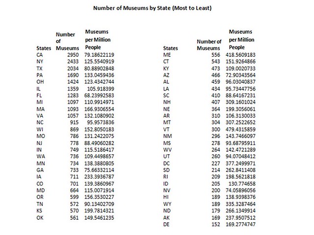
And, if you are more of a numbers person, this grid sorts the states by number of museums.
But, I don’t think this really shows a picture of the haves and have nots in terms of museums. How does this break down per capita? I used the census numbers to start thinking about that.
First, I calculated the number of museums per million people and sorted this per state.
I was also playing around with thinking of the collective mass of museums and how they are distributed across the country. This graphic shows each state as a percentage of the total population, and each state’s percentage of total museums.
Finally, perhaps because I began thinking about these numbers when I was enjoying the hospitality of the American Alliance of Museums, I wanted to see how this compares to accredited museums. As of Jan 14, there are 779 accredited museums, according to AAM’s site. AAM reports their categories by field slightly differently than IMLS. For example, AAM broke out Zoos and Aquariums separately, where as IMLS had them in a combined field. So, I went with IMLS’s categories. Here is how they compare:
Has anyone else started playing around with the data set? What have you found? What other graphics are you thinking about generating?


